La Piñata – Brand Identity & Graphic Design
La Piñata is a handmade piñata studio creating fully personalized experiences for kids — custom shapes, surprise-filled packages, and all the color and joy of a real Mexican birthday celebration.
La Piñata is a handmade piñata studio creating fully personalized experiences for kids — custom shapes, surprise-filled packages, and all the color and joy of a real Mexican birthday celebration.
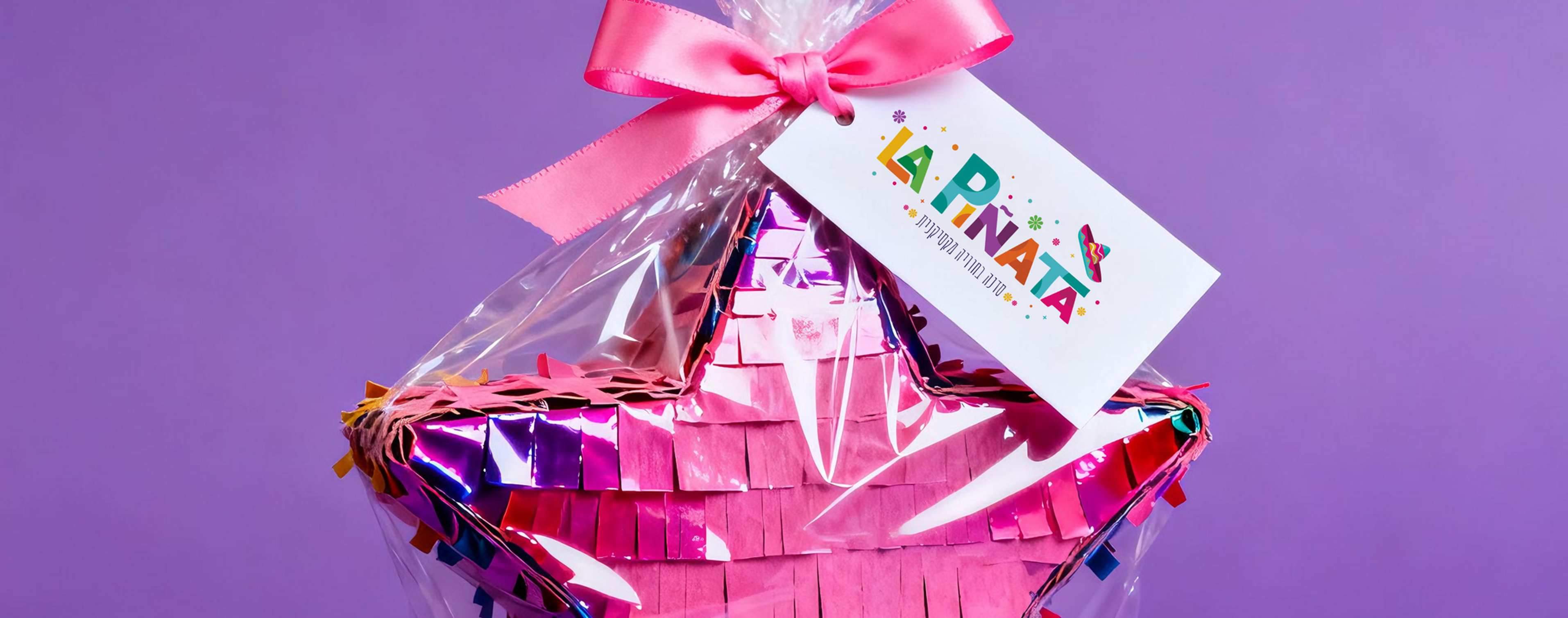
I designed the full brand identity for La Piñata — logo, color system, and conceptual design. The challenge was capturing something that feels genuinely festive and Mexican, while being warm enough to make every parent and child feel like this was made just for them.
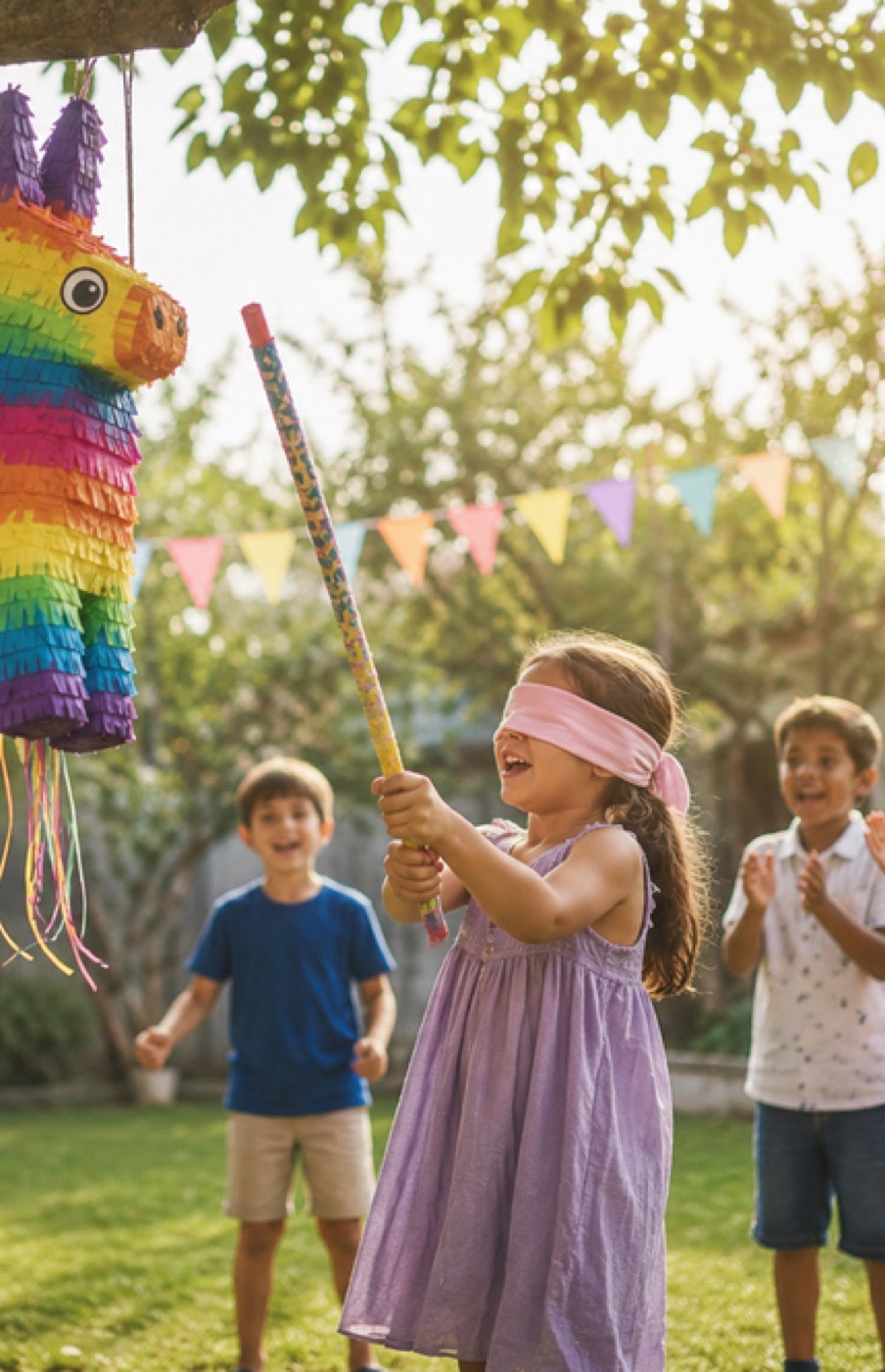
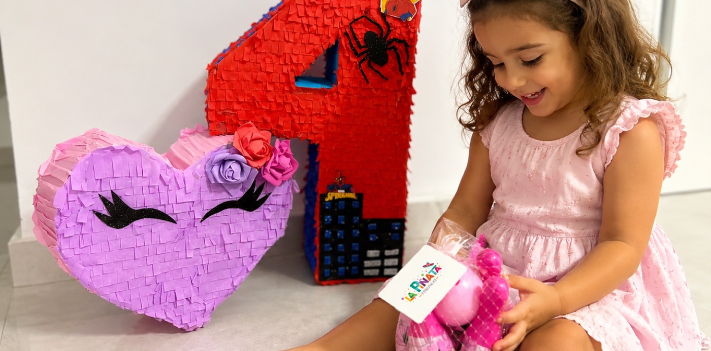
La Piñata isn't just a product — it's a whole experience. Every piñata is handmade to order, in any shape the child can imagine, packed with surprises inside. The brand had to carry that same energy: explosive color, endless variety, and pure joy.
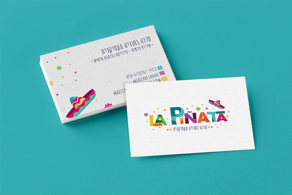
The logo brings together everything La Piñata stands for — a Mexican sombrero at the center, surrounded by confetti and circles bursting outward like a piñata just hit. The color palette is taken directly from traditional Mexican design: loud, bold, and impossible to ignore. Every detail is intentional — the shapes, the explosion of color, the sense of movement — all working together to say: this is a celebration.
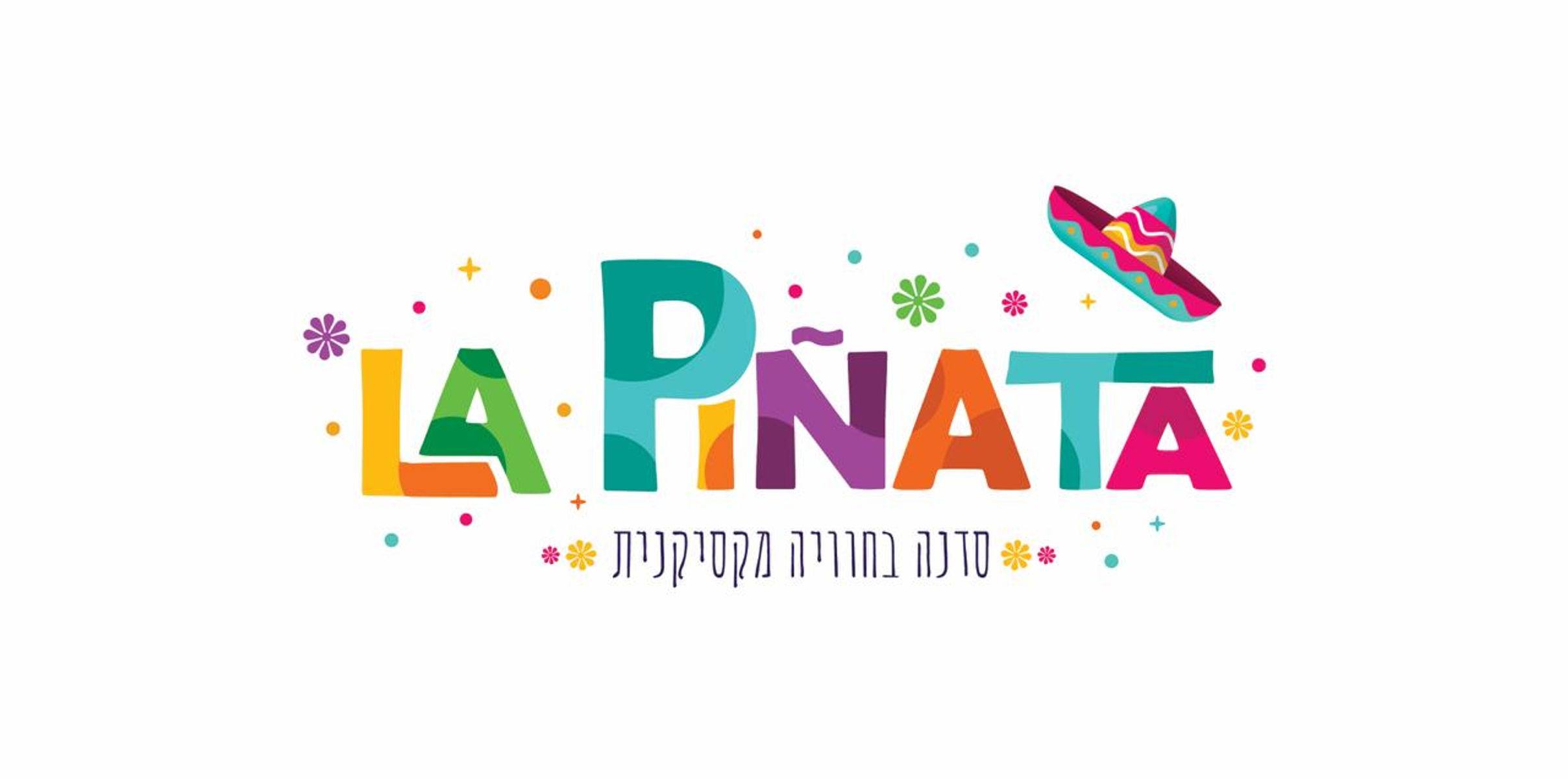
From the moment a child sees the box arrive, the brand experience begins. The colors shout celebration before a word is read. The shapes echo the handmade, one-of-a-kind nature of every piñata. And the wordmark — bold, playful, bursting with energy — makes it clear: this isn't just a party decoration, it's the main event.
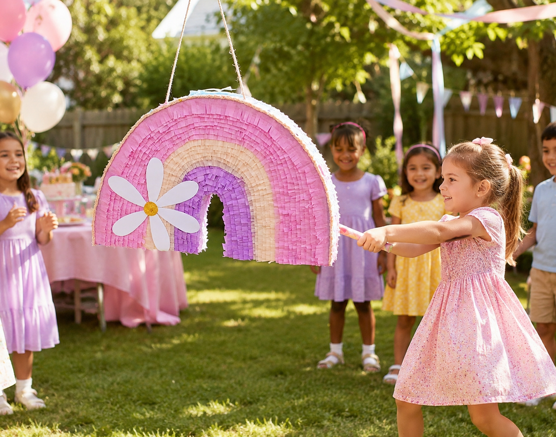
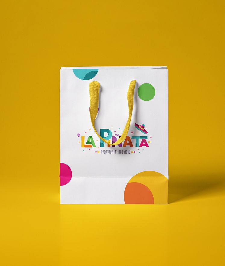
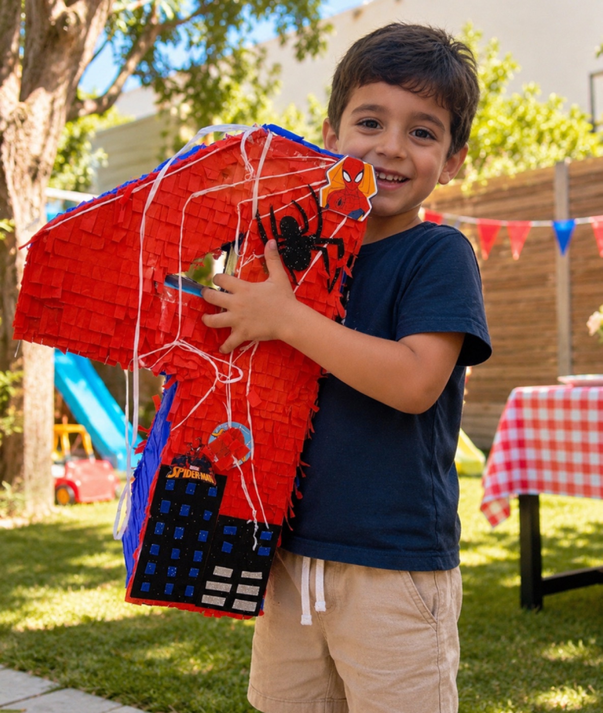
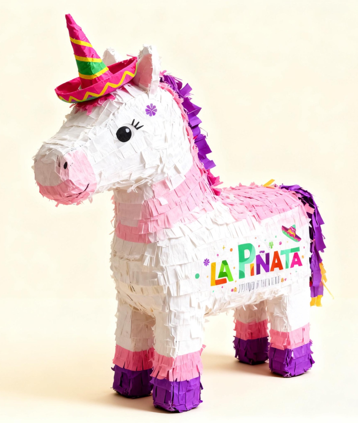
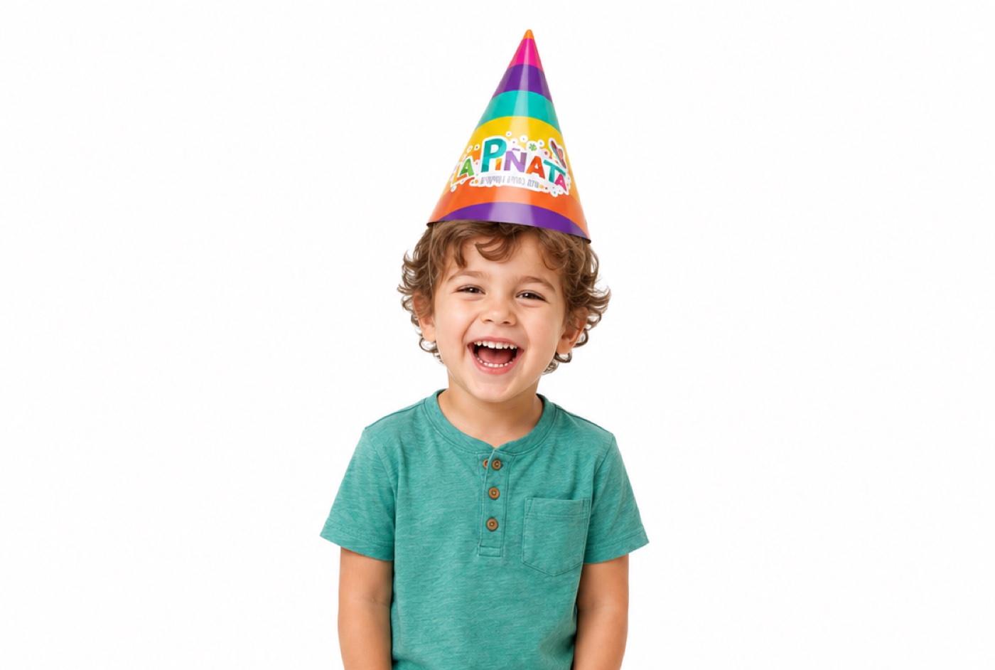
La Piñata brings the wildest, most joyful energy to every birthday. The design speaks the same language as the product — vibrant, handmade, one-of-a-kind. Because when a piñata bursts open, everything should feel like a surprise.