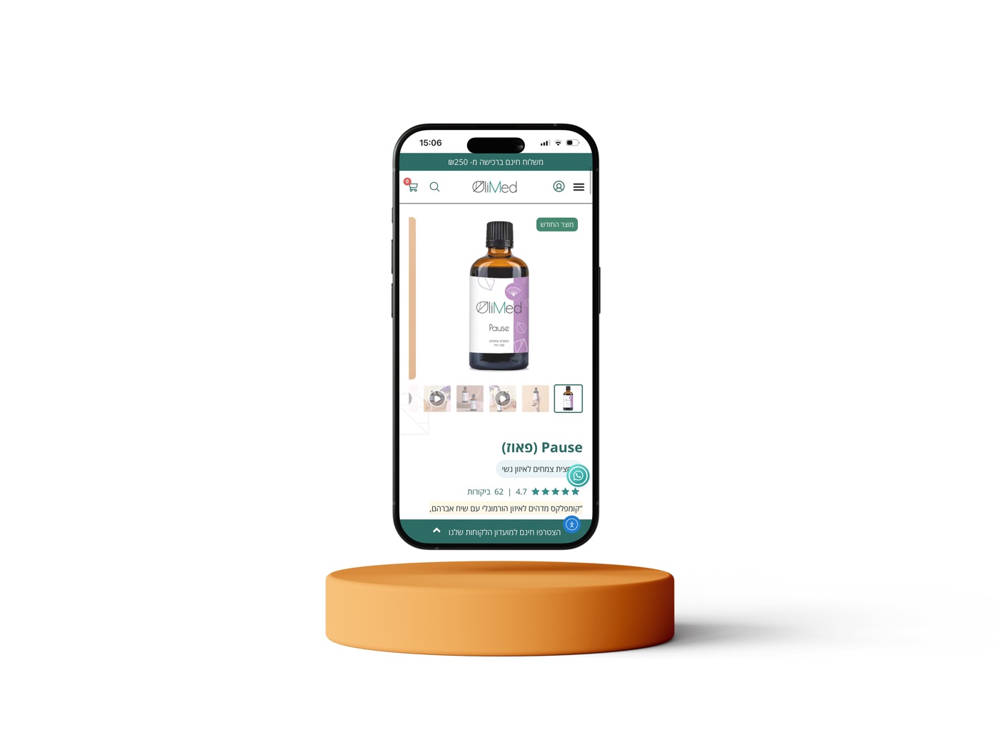
OliMed – Brand Identity & Packaging Design
A full rebranding for OliMed — an Israeli company producing herbal extracts and natural products for alternative medicine. From logo to packaging to a large e-commerce website.
A full rebranding for OliMed — an Israeli company producing herbal extracts and natural products for alternative medicine. From logo to packaging to a large e-commerce website.
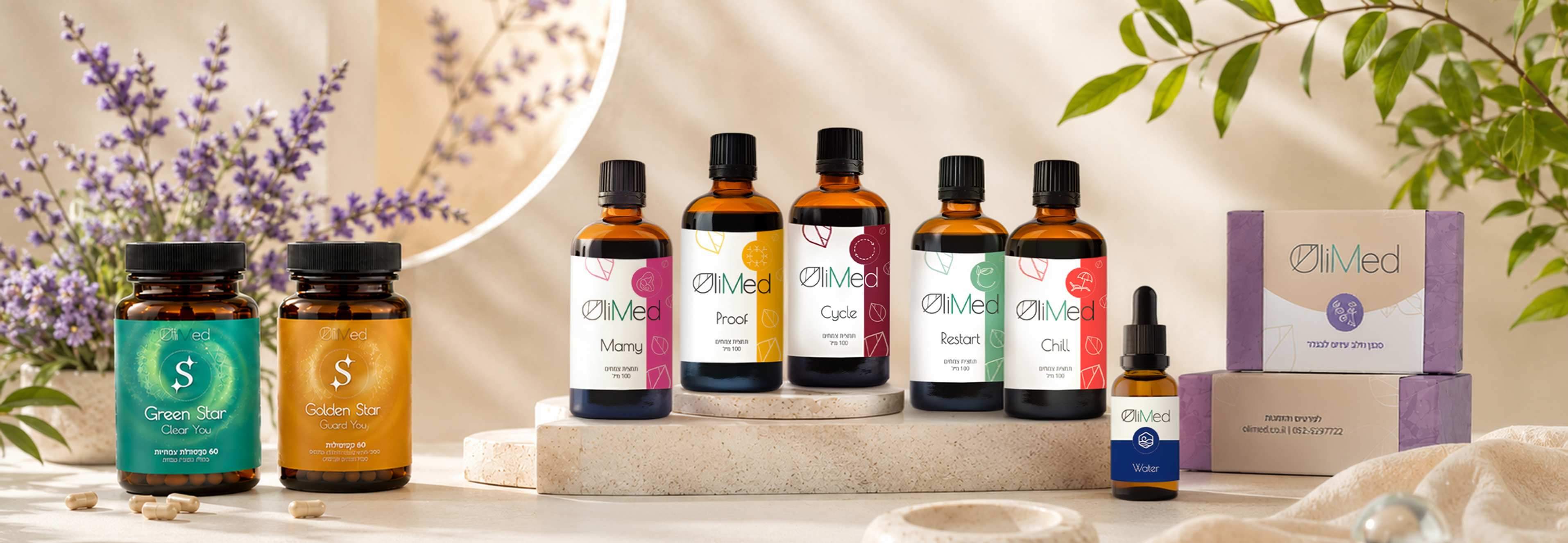
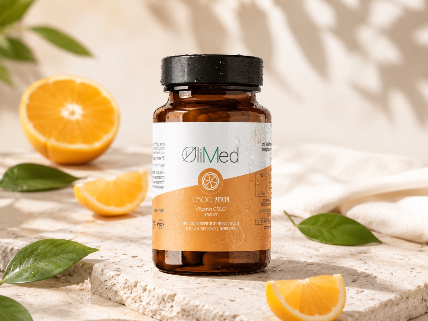
I led the complete rebranding — logo design, color system, and packaging across the entire product line, followed by the visual design of the e-commerce website. The brief was to move away from a generic, clinical look and create something colorful, approachable, and still rooted in nature.
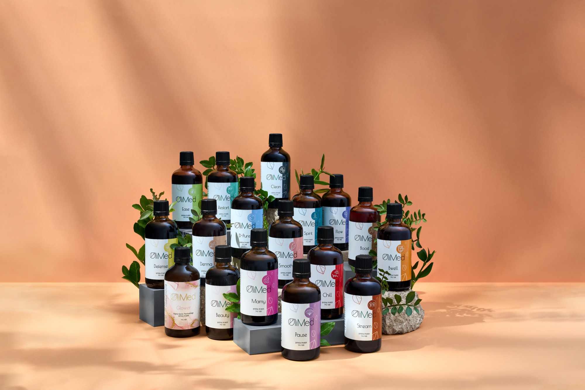
OliMed offers a wide range of products — herbal extracts, oils, aroma blends, creams, and teas. The branding had to create clear visual order across a large catalog, while keeping the warm, natural feel of the brand intact.
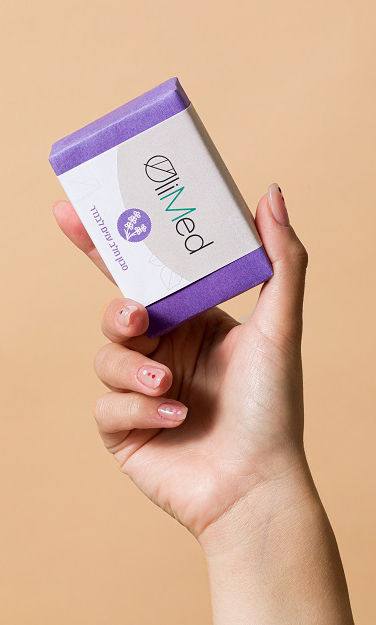
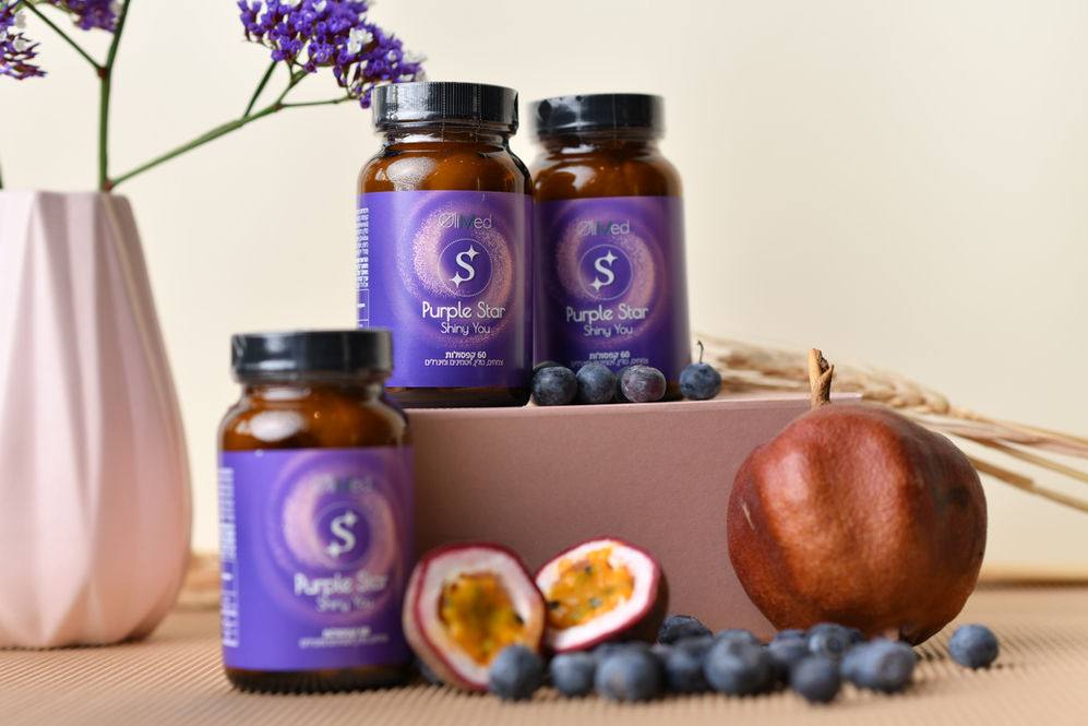
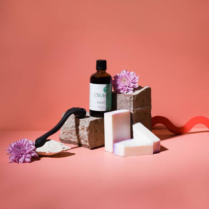
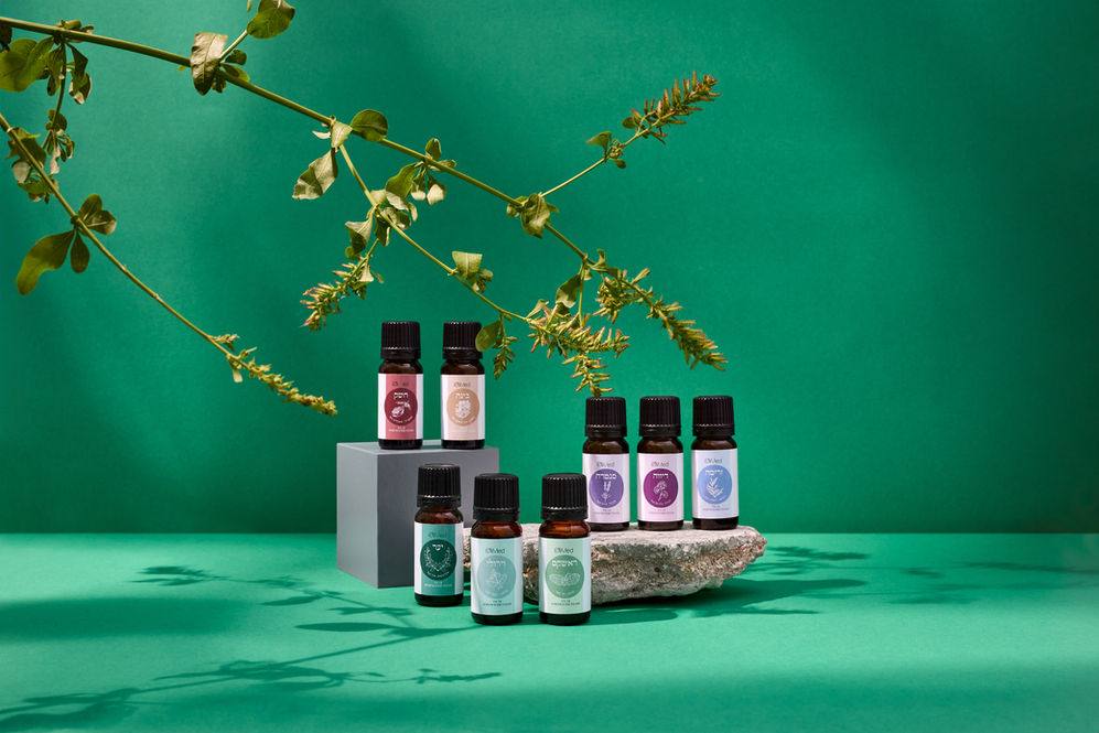
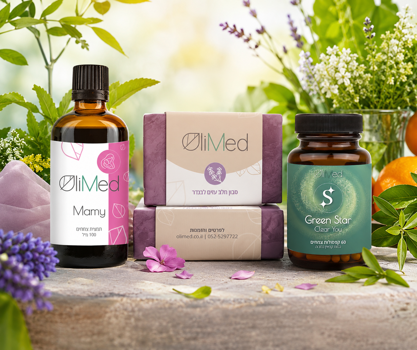
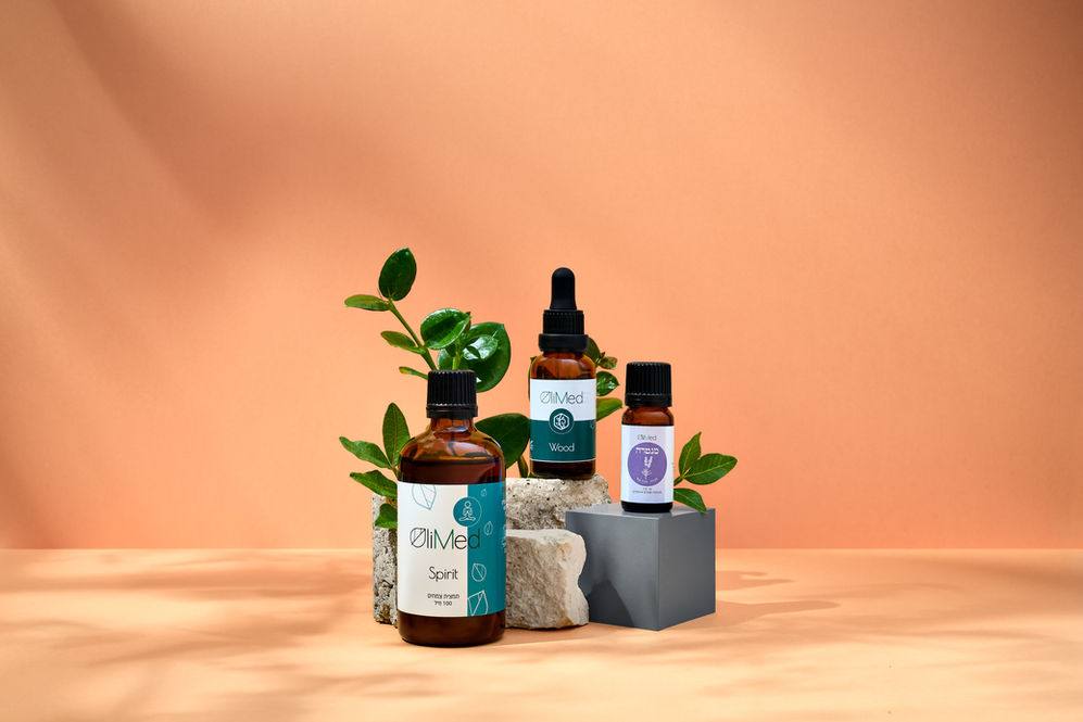
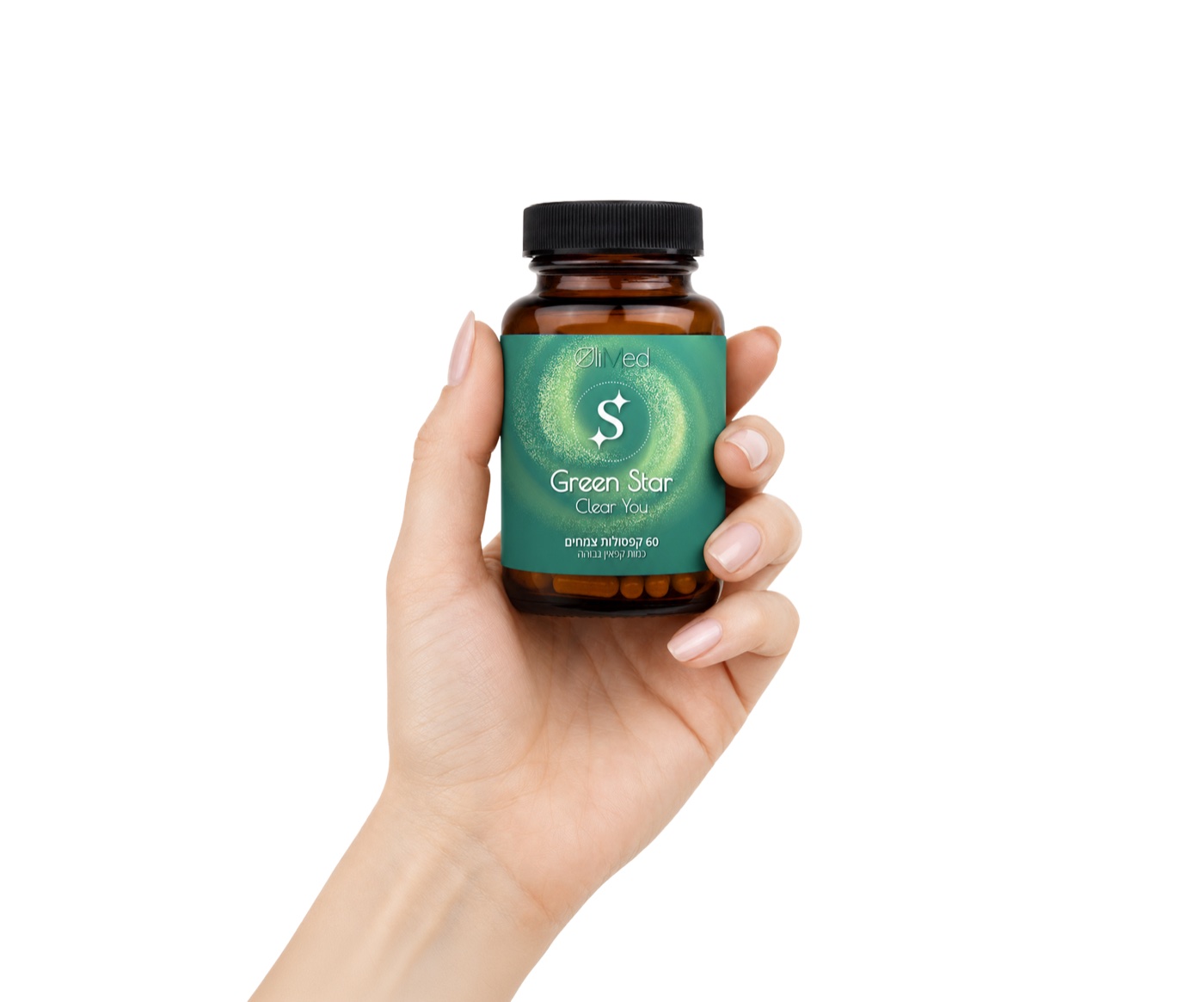
Each extract got its own color, chosen to reflect the plant or the area it treats — making the product range instantly navigable. Three anchor colors ground the entire palette: green (plants), brown (earth), and dark gray (stone) — keeping the brand honest to its natural identity while allowing for bold, expressive packaging.
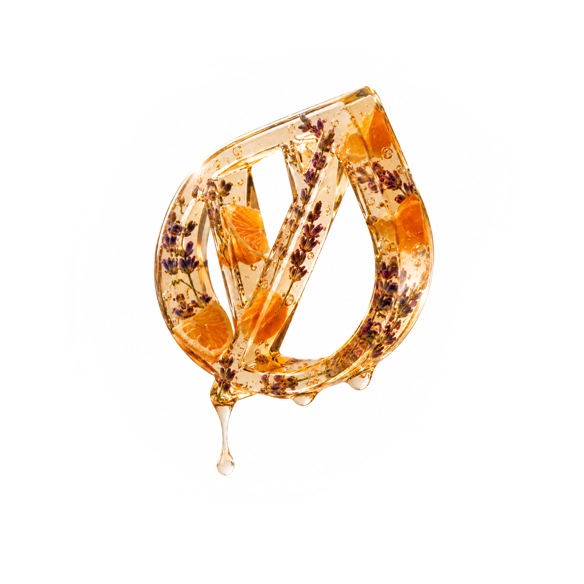
The letter O in OliMed is drawn as a leaf — a quiet but deliberate detail that becomes the brand's visual signature. Clean and modern, with just enough of a natural reference to carry through every touchpoint of the brand.
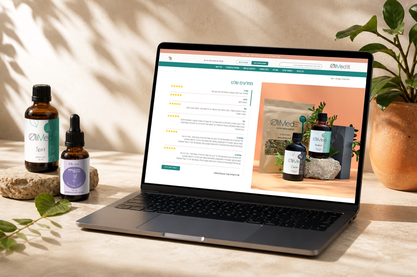
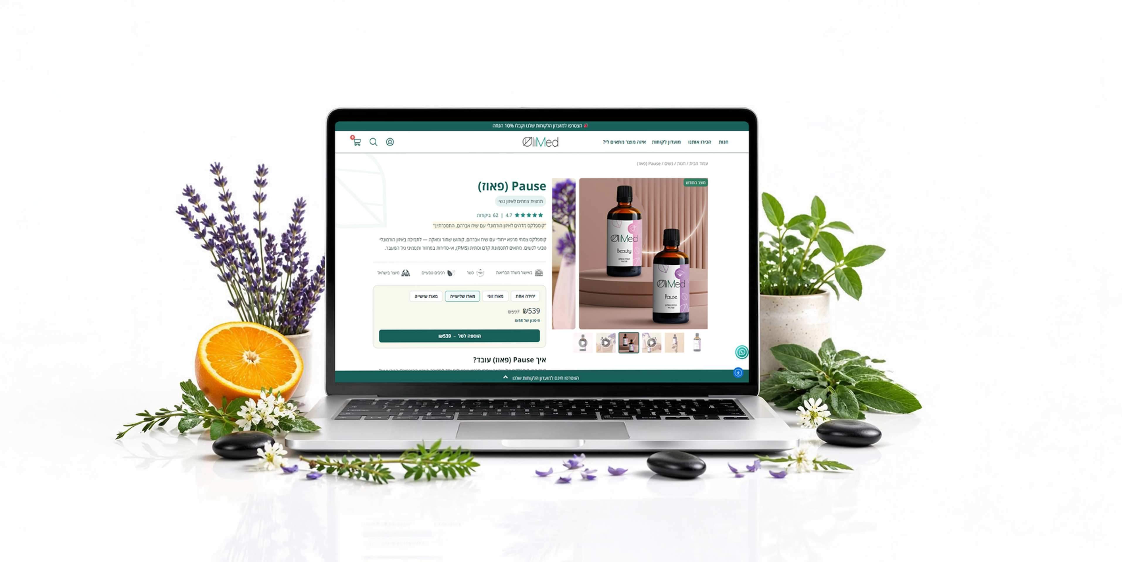
The new OliMed website was built from the ground up with the user in mind — clean, intuitive, and beautifully designed for every screen and device.
Every detail was carefully crafted to reflect the brand's core values: nature, quality, and trust — delivering a seamless shopping experience that feels as pure as the products themselves.